
This is (hopefully) a beginner-friendly tutorial in attempting to model SPY data using linear time series models. Specifically, we take a look at basic properties of the data, the fitness of AR, MA, ARMA, and ARIMA models, and, spoiler alert, why they suck at the job.
***
A good refresher from my article on linear time series models reminds us that unlike static data, the error term in time series data exhibits autocorrelation, which violates the assumption of independent for static models. Therefore, we use time series models because they’re capable of explicitly removing autocorrelation from the error term by modeling it through lagged predictor variables.
Data Collection and Preparation
Let’s start by importing the SPY adjusted close price data by using the yfinance library as follows:
import yfinance as yf

spy_prices = yf.download(
    '^GSPC', start='2010-01-01', end='2025-12-31',
    auto_adjust=True, progress=False
)['Close'].dropna()
Plotting the price data against time, we obtain the curve below.
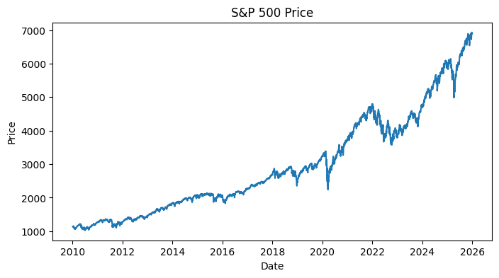
Just by this visualization, we can immediately tell that the data is non-stationary. In fact, price levels are notoriously random walks with a trend, i.e., the mean and variance evolves over time, which violates the assumption of our linear time series models. Therefore, we instead take the log returns, given by
which is akin to differencing the levels. Recall that this removes the trend and approximates stationarity:
import numpy as np
spy_log_rets = np.log(spy_prices / spy_prices.shift(1)).dropna()
Why log returns? Because they’re continuously compounded returns and are approximately equal to percentage changes for small moves. Also, they’re additive across time, making multi-period aggregation pretty clean. Let’s look at how the plot looks like.
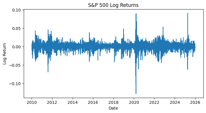
Much better! This mean-reverting pattern is what we’d expect of an approximately stationary time series. Just to be extra certain, we could also run ADF and KPSS tests to quantitatively ascertain this property at a 95% critical threshold. However, we want to first split the data into train and test sets, and only run these tests on the train set (because we assume that we don’t know anything about the test set):
train = spy_log_rets.loc['2010-01-01':'2020-01-01']
test = spy_log_rets.loc['2020-01-01':'2025-12-31']
from statsmodels.tsa.stattools import adfuller, kpss
adf_res, kpss_res = adfuller(train), kpss(train)
print(f"ADF p: {adf_res[1]} | KPSS p: {kpss_res[1]}")The ADF and KPSS tests produce a -value of much lower than and 0.1, respectively; we have exceeding confidence that the log returns data is indeed stationary. For downstream model selection, we’ll also visualize the ACF and PACF plots:
from statsmodels.graphics.tsaplots import plot_acf, plot_pacf

plot_acf(train, lags=40, ax=axes[0], color='steelblue', zero=False)
plot_pacf(train, lags=40, ax=axes[1], color='steelblue', zero=False, method='ywm')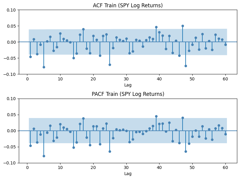
As we can see, there’s actually no meaningful linear autocorrelation structure in the returns. The spikes we see that jute out the top and bottom of the highlighted area are almost certainly due to random noise. Anyway, practically, AR, MA, ARMA, and ARIMA have nothing to model here.
Model Selection
The ACF and PACF plots don’t show any ideal parameters for and for our time series models. So, instead, we run a grid search to compare the performance of different parameters for the four models. Let’s define the function search_orders as
from statsmodels.tsa.arima.model import ARIMA
from itertools import product
import pandas as pd

def search_orders(train, p_range, d_range, q_range, model_type):
    results = []
    for p, d, q in product(p_range, d_range, q_range):
        if model_type == 'AR'   and (q != 0 or d != 0):  continue
        if model_type == 'MA'   and (p != 0 or d != 0):  continue
        if model_type == 'ARMA' and (d != 0):            continue
        if model_type == 'ARIMA'and (p == 0 and q == 0): continue
        try:
            model = ARIMA(train, order=(p, d, q)).fit()
            results.append({
                'Model': f'{model_type}({p},{d},{q})',
                'p': p, 'd': d, 'q': q,
                'AIC': model.aic,
                'BIC': model.bic,
            })
        except:
            continue
    return pd.DataFrame(results)
and then run the grid search per model family:
ar_res    = search_orders(train, range(1, 6), [0],         [0], 'AR')
ma_res    = search_orders(train, [0]        , [0], range(1, 6), 'MA')
arma_res  = search_orders(train, range(1, 5), [0], range(1, 5), 'ARMA')
arima_res = search_orders(train, range(1, 4), [1], range(1, 4), 'ARIMA')
The top three models for each family is provided below.
=== Best AR models by AIC ===
    Model  p  d  q           AIC           BIC
AR(5,0,0)  5  0  0 -16394.228115 -16353.417918
AR(1,0,0)  1  0  0 -16382.761682 -16365.271598
AR(3,0,0)  3  0  0 -16382.206910 -16353.056769

=== Best MA models by AIC ===
    Model  p  d  q           AIC           BIC
MA(0,0,5)  0  0  5 -16394.762515 -16353.952318
MA(0,0,1)  0  0  1 -16382.694300 -16365.204216
MA(0,0,3)  0  0  3 -16382.280098 -16353.129958

=== Best ARMA models by AIC ===
      Model  p  d  q           AIC           BIC
ARMA(2,0,3)  2  0  3 -16381.589457 -16340.779260
ARMA(1,0,1)  1  0  1 -16381.373827 -16358.053714
ARMA(4,0,4)  4  0  4 -16381.044556 -16322.744275

=== Best ARIMA models by AIC ===
       Model  p  d  q           AIC           BIC
ARIMA(1,1,1)  1  1  1 -16365.330959 -16347.842068
ARIMA(3,1,1)  3  1  1 -16363.440799 -16334.292647
ARIMA(2,1,2)  2  1  2 -16363.201821 -16334.053669
Remember that AIC has no meaningful absolute scale, i.e., only differences between models matter. As expected, there’s no one good model distinguishable from the rest to properly model SPY log return data.
Fitted AR(5) Model Diagnostics
Now that we know each model is unsuitable for the task, let’s explore this a little more anyway, considering only the AR(5) model. As we’ll see, the fitted model spectacularly fails for the task. Nevertheless, note how analyzing where and why it fails directs us to a more correct model.
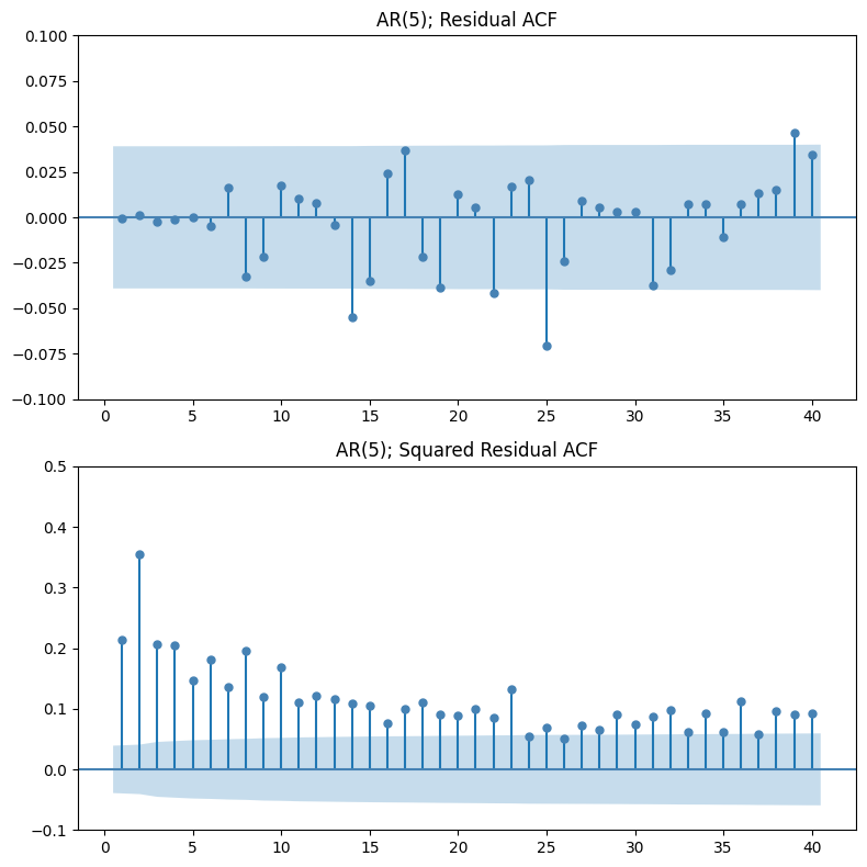
The residual ACF plot looks clean but is actually meaningless. The model didn’t successfully remove autocorrelation because there were none to begin with (recall the ACF plot of the train data). This suggests that the structure in SPY log returns isn’t linear, which is why linear time series models like AR, MA, ARMA, and ARIMA fail to find any structure.
The squared residual ACF plot tells a completely different story. We observe significant spikes at multiple lags, in sharp contrast to the flat ACF of raw returns. This is the evidence that while returns themselves are uncorrelated, their magnitude is not. Variance has memory the models failed to capture.
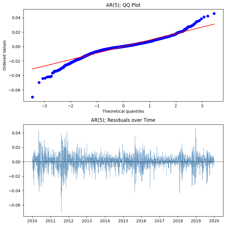
The QQ plot shows a classic case of leptokurtosis (fat tails). In other words, the models themselves are misspecified at a foundational level because they assume Gaussian errors. They’ll be dangerously wrong when making any risk estimation.
The residuals (returns) over time plot shows an obvious case of volatility clustering which the models completely missed. There’s systematic, predictable structure in the variance but since ARIMA only models the mean, it’s blind to this entirely.
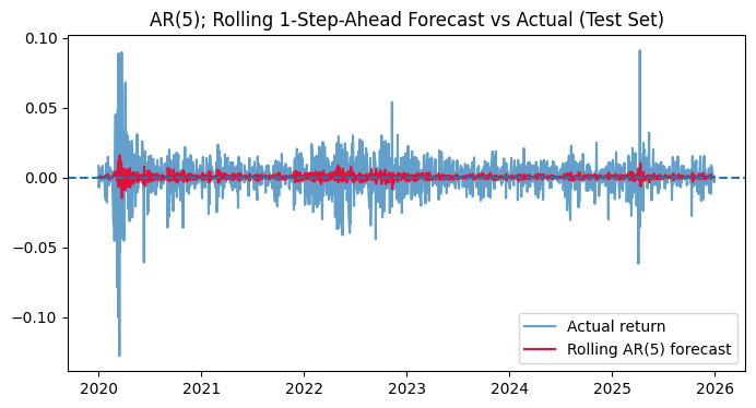
Additionally, with no exploitable autocorrelation structure, the best these models can do is forecast the unconditional mean (~0) at every step. They’ve pretty much learned nothing from the history of returns beyond “the average is close to zero.”
***
The beautiful necessity in understanding ARIMA’s failure in modeling financial data is in hinting us exactly where to look next. AR, MA, ARMA, and ARIMA all implicitly ask: is there predictable structure in the conditional mean of returns? For SPY, the answer is no. The flat forecasts, the fat-tailed residuals, and the failed naïve benchmark comparison all point to the same conclusion.
As a matter of fact, the structure in equity returns doesn’t live in the mean, but the variance. Volatility clusters. Extreme moves beget extreme moves. That is a GARCH problem, not an ARIMA problem, and it’s where the more interesting modeling actually begins.
Leave a Reply