
One natural question we should ask is whether stocks can be grouped by how they behave, rather than just by the sector labels someone assigned them decades ago. For example, here’s one of many things sector labels don’t capture: a tech company and a utility might sit in completely different industries, yet move in near-perfect lockstep during a market downturn.
That’s why in this article, we’ll use -mean clustering to classify a universe of stocks based on their return and volatility characteristics. Of course, there are likely more robust ways of choosing factors for the task, e.g., including other features such as price-earnings and risk-return ratios. However, we’ll keep things simple here, given the choice of features is beyond the scope of this article.
Anyway, along the way, we’ll cover how the algorithm actually works, how to pick , and how to run it.
***
We begin with the idea behind -means: choose centroids and a hard assignment of each point to one centroid to minimize total squared distance to assigned centers; solve this (approximately) by alternating between nearest-centroid assignment and mean recomputation; use smart initialization and multiple restarts because the problem is non-convex; and report the final centroids, labels, and inertia as the fitted clustering.
Mathematically, suppose we have data , and we want clusters. In this sense, the classical -means objective is
where is the cluster assignment of and is the centroid of cluster . If you’ve got a keen eye, you could probably tell that is simply the Euclidean distance between and the centroid of the cluster it’s assigned to. Explicitly, in -means, we use the squared version:
which measures how far the point is from its cluster center across features.
The main difficulty here is that this isn’t a convex optimization problem in the joint variables and — the assignments are discrete, the centroids are continuous, and the space of possible clusterings is enormous. Therefore, we employ Lloyd’s algorithm, which is an iterative coordinate-descent-style procedure that alternates between:
- improving assignments while holding centroids fixed, and
- improving centroids while holding assignments fixed.
Lloyd’s Algorithm
The logic of the algorithm is pretty elegant. In the assignment step, we suppose that the centroids are known. Then, to minimize
each point should clearly be assigned to whichever centroid is closest, because the terms in the sum are separable in . Formally, with centroids fixed, the optimal assignment rule is
Understandably, it’s sometimes called the “E-like” step since it resembles the assignment part of expectation-maximization, but in -means it’s a hard deterministic reassignment (i.e., not a probabilistic expectation).
In the update step, we instead fix the cluster assignments. In this case, the objective decomposes by cluster:
where represents the set of indices in cluster . For each , the centroid can be optimized independently by solving
Taking its derivative w.r.t. and setting it to zero yields
which literally means that the best centroid, conditional on current assignments, is the sample mean of the assigned points.
Now, simply putting these together, we can understand that Lloyd’s algorithm starts from some initial centroids and repeats
and then
where . Each of these two steps cannot increase the objective, meaning the within-cluster sum of squares (WCSS)
is non-increasing over iterations. Since there are only so many possible hard partitions of points into groups, the algorithm eventually converges to a fixed point — a local minimum.
Data Preparation
Now that we’ve gotten the theory out of the way, let’s begin by loading the dataset that we’ll be using. Our two factors will be the average annualized returns and average annualized volatility.
import pandas as pd
import yfinance as yf
from math import sqrt

url = "https://en.wikipedia.org/wiki/List_of_S%26P_500_companies"
tables = pd.read_html(url, storage_options={'User-Agent': 'Mozilla/5.0'})
tickers = tables[0]['Symbol'].values.tolist()
tickers = [
    s.replace('\n', '').replace('.', '-').replace(' ', '') for s in tickers
]

prices_df = yf.download(
    tickers,
    start='2025-01-01',
    end='2026-01-01',
    auto_adjust=True,
    progress=False
)["Close"]

prices_df.sort_index(inplace=True)
rets_df = pd.DataFrame({
    'Returns': prices_df.pct_change().mean() * 252,
    'Volatility': prices_df.pct_change().std() * sqrt(252)
})

X = rets_df[['Returns', 'Volatility']].dropna().values
Recall the formula for the loss function (WCSS). Since it aims to minimize a sum of squares, features with larger scale dominate the squared Euclidean distance. To avoid bias, we should therefore scale the data accordingly.
from sklearn.preprocessing import StandardScaler

scaler = StandardScaler()
X_scaled = scaler.fit_transform(X)
Optimal Choice of K
Choosing an optimal is necessary to balance between underfitting (having too few clusters) and overfitting (having too many clusters). To do this, we look at two complementary quantities: the WCSS, which measures how tightly points are grouped around their assigned centroids, and the mean silhouette score, which captures both how cohesive and how well-separated the clusters are.
While WCSS always decreases as increases, making it difficult to identify a clear stopping point, the mean silhouette score provides a more balanced measure. We define it as
where is the average distance of to points in its own cluster, and is the minimum average distance to points in the nearest neighboring cluster. Intuitively, we can understand this quantity as rewarding clusters that are both internally tight and externally well-separated.
import matplotlib.pyplot as plt
from sklearn.cluster import KMeans
from sklearn.metrics import silhouette_score

inertias = []
silhouette_scores = []
K_range = range(1, 11)

for k in K_range:
    kmeans = KMeans(
        n_clusters=k, init='k-means++', n_init=10, random_state=42
    )
    kmeans.fit(X_scaled)
    inertias.append(kmeans.inertia_)

    if k > 1:
        score = silhouette_score(X_scaled, labels)
        silhouette_scores.append(score)
    else:
        silhouette_scores.append(None)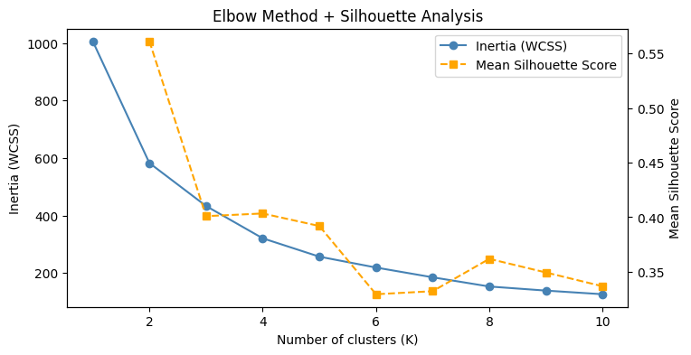
In our case, is highest at and shows a smaller local peak at . Combined with the ambiguous elbow in WCSS, this somewhat suggests that the data may naturally organize into two dominant regimes, with further refinement into four clusters capturing more nuanced differences.
I shall conclude that offers the clearest high-level segmentation, while provides a more detailed and informative view of the underlying structure. As such, we’ll proceed with .
K-Means Fitting and Analysis
Now, we can simply rerun KMeans with n_clusters=4 keeping all else equal and plot the corresponding color-labeled scatterplot.
kmeans = KMeans(n_clusters=4, init='k-means++', n_init=10, random_state=42)
labels = kmeans.fit_predict(X_scaled)

plt.scatter(
    X_scaled[:, 0],
    X_scaled[:, 1],
    c=labels
)
plt.scatter(
    kmeans.cluster_centers_[:, 0],
    kmeans.cluster_centers_[:, 1],
    marker='X'
)
plt.show()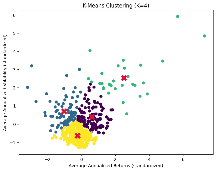
As expected, most of the points are clustered around each of the four centroids. After fitting -means, we define outliers in a very natural way: points that lie unusually far from their assigned cluster center. Concretely, for each point we compute the distance (not squared distance), and then, within each cluster, flag points that exceed a threshold of the cluster mean plus two standard deviations.
Defining outliers per cluster is important because different clusters can have very different spreads, so an extreme distance in a tight cluster may be completely normal in a more dispersed one. This gives a fair, local notion of what it means to be “far”.
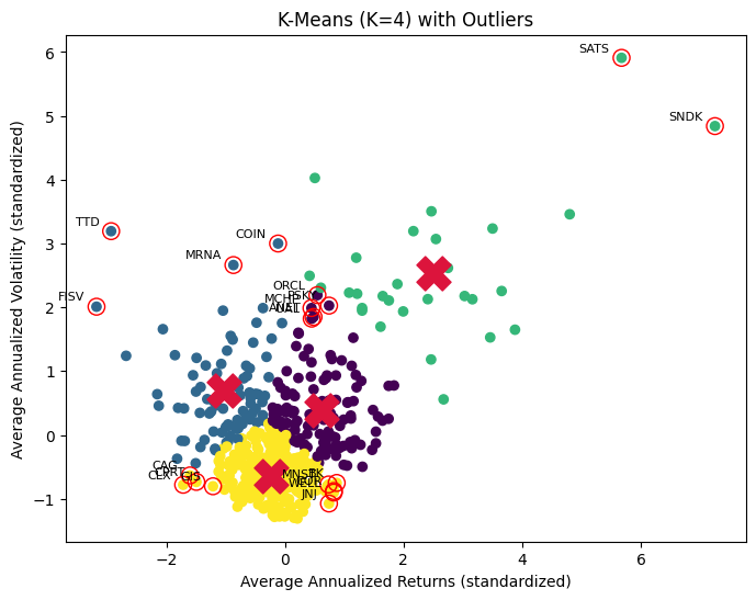
However, in the context of financial data, outliers need to be interpreted carefully. -means labels something as an outlier simply because it doesn’t fit well into its geometry, which isn’t the same as labeling a data point as bad, noisy, or erroneous.
For instance, in the case of EchoStar (SATS), the extreme volatility and returns were driven by event risk (fears of bankruptcy and regulatory pressure around its spectrum assets), followed by major positive developments ($23 billion spectrum sale to AT&T and $17 billion spectrum deal with SpaceX). Obviously, this isn’t about bad data.
In this sense, identifying outliers is less about preprocessing (i.e., treating noise) and more about diagnosis (i.e., interpreting structurally different assets). Regardless, our simple clustering analysis is useful for investors looking to diversify their investment portfolios, as it allows them to identify groups of stocks with different levels of risk and return (w.r.t. our determined factors and subject to model limitations).
This essentially serves as a useful starting point for risk-diversification in portfolio optimization settings.
K-Means Limitations
Our previous example showcases one limitation of -means: it groups assets purely based on geometric proximity and summarizes each cluster by a single “average” point. This works well when the data is homogeneous and clusters are roughly spherical, but stocks are often driven by unique narratives which can’t be meaningfully represented by a single centroid (e.g., elongated, skewed, heteroskedastic).
Perhaps most importantly in financial contexts, it struggles with heterogeneous data where small but meaningful groups or rare events carry significant information.
If these limitations matter, there are more suitable alternatives depending on the goal:
- Gaussian Mixture Models (GMMs) extend K-means by allowing soft cluster membership and flexible covariance structures, making them better at handling overlapping or non-spherical clusters.
- Density-based methods like DBSCAN can explicitly identify outliers without forcing them into clusters.
- Hidden Markov Models (HMMs) may be more appropriate if the data is driven by regimes or time dynamics.
Even within the K-means framework, we can mitigate some issues by careful feature engineering, scaling, or clustering in a richer feature space. Anyway, the key idea is to recognize that -means is a geometric simplification that’s be useful for capturing broad structure, but not designed to explain the most extreme or structurally unique observations.
***
-means is generally a great starting tool for capturing broad structure even in financial data science. It helps us see the overall landscape, and just as importantly, highlights where that simple picture breaks down.
It’s precisely because of its weaknesses that we can see where it breaks down, allowing us to move on to more appropriate models like GMMs, DBSCAN, or HMMs depending on the underlying structure of the data we’re dealing with.
Leave a Reply